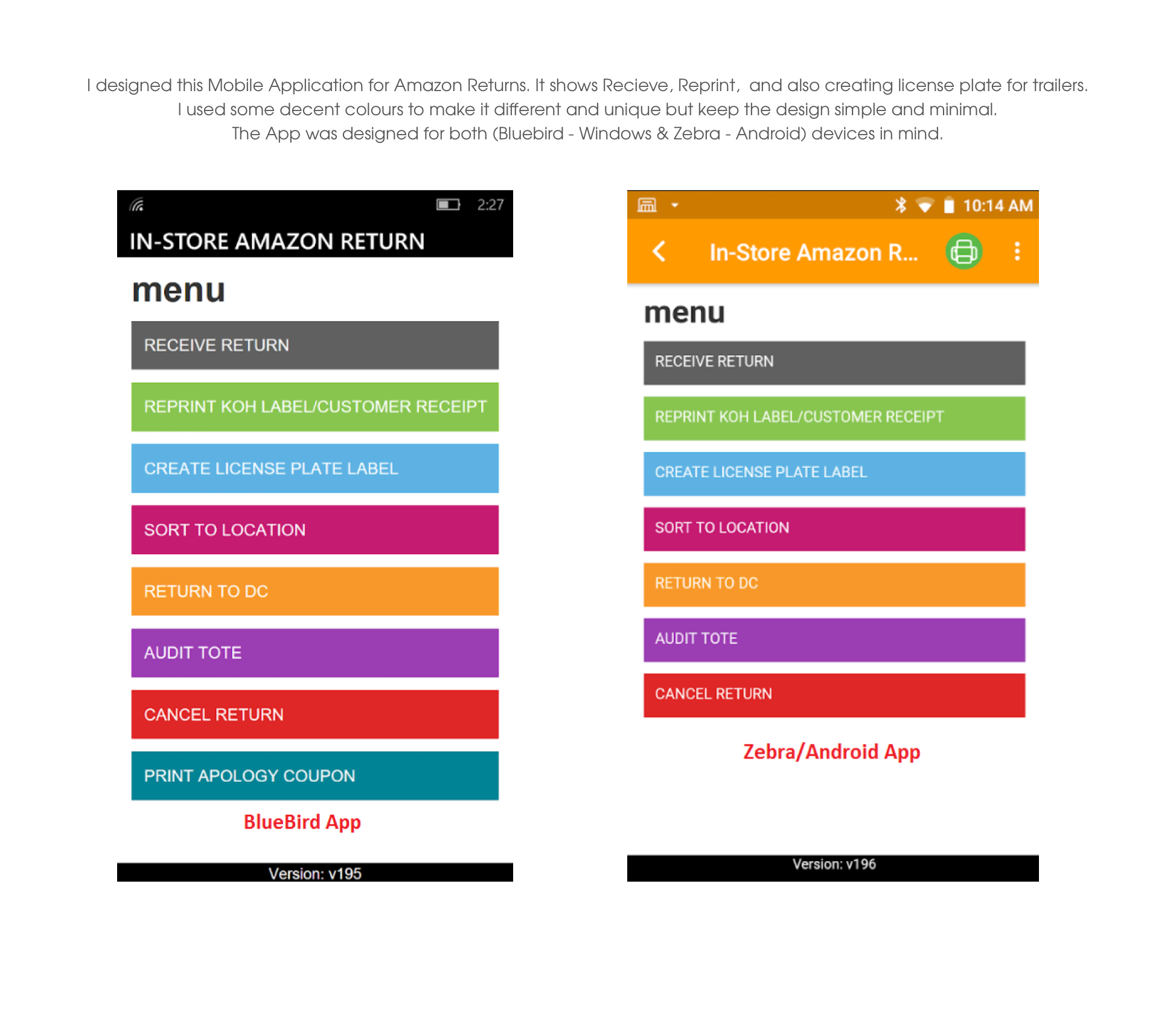
An app that recieves Amazon product returns from customer at Kohl's store
Amazon Returns

Mobile / Web App
This app was build to recieve all the Amazon product return from customer at kohl's store, In return kohl's offering more coupons and kohl's cash for every amazon return. By this way kohl's driving more customers to store, Engage new customers, Give customers a new reason to check out Kohl’s. See for yourself.
App approach
Amazon Return App is a system that consists of physical sensors that are deployed on-site, and a dashboard. The sensors capture and assess customer barcode such as Tracking ID, QR Code, view product details, name, address etc. The data is then anonimized and relayed back to a dashboard, On the other end Kohl's coupons or cash offers are printed and hadled over to customers as well. Once there, customers amazon return request are processed and also allowing them to buy any items in kohl's store with valid coupons.

Drive Traffic to kohls stores through Amazon Customers
Kohl’s is a leading omnichannel retailer with more than 1,100 stores in 49 states. Kohl's partnership with Amazon brings more opportunity for kohls to engage new customers in stores, allowing customers to bring in their
unpackaged Amazon returns to Kohl’s and we will pack them, ship them, and return them to Amazon for free
The App is focused on deleivering smooth process for customers who preferred kohls store for amazon returns and providing kohl's printed coupons.
Listening was the first step
There was a working prototype to use as a jumping-off point, but it was far from feature rich, or visually appealing. However, it proved helpful in understanding the complexity and scope of the project. I assessed the interface, implemented UX solutions from the ground up (calling on best practices as necessary,) and finished it off with a wall-to-wall user interface that cleanly met the challenge.
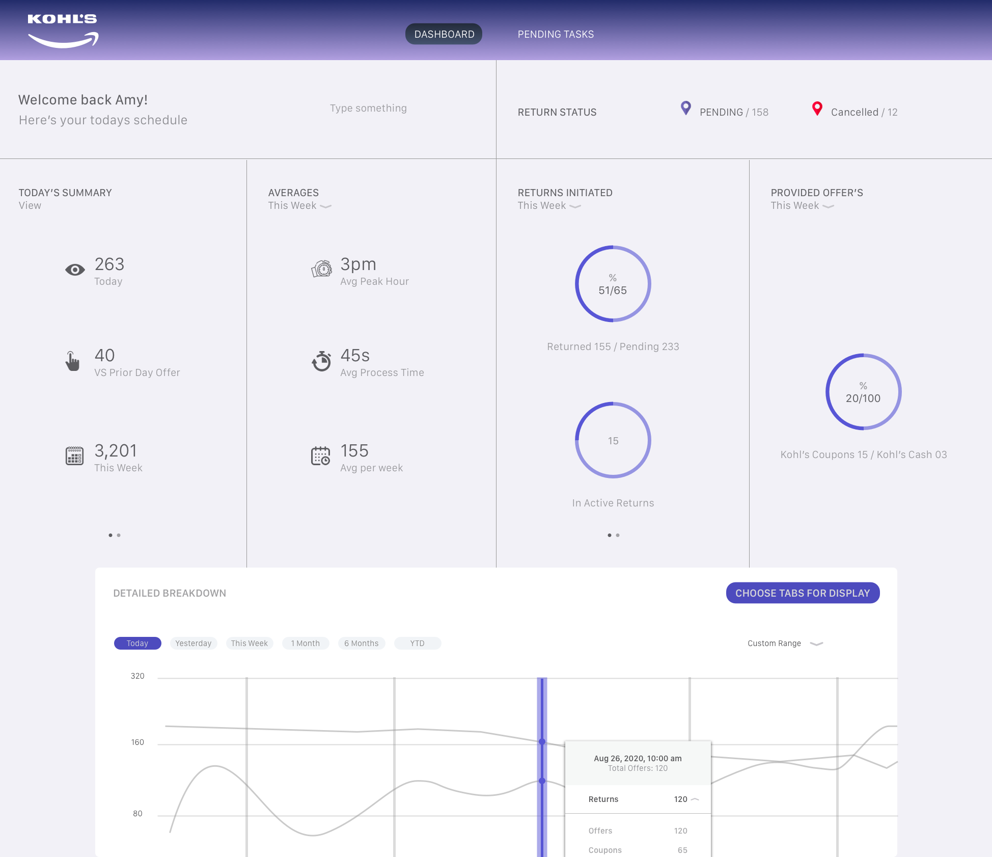
Dashboard
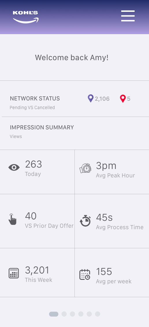
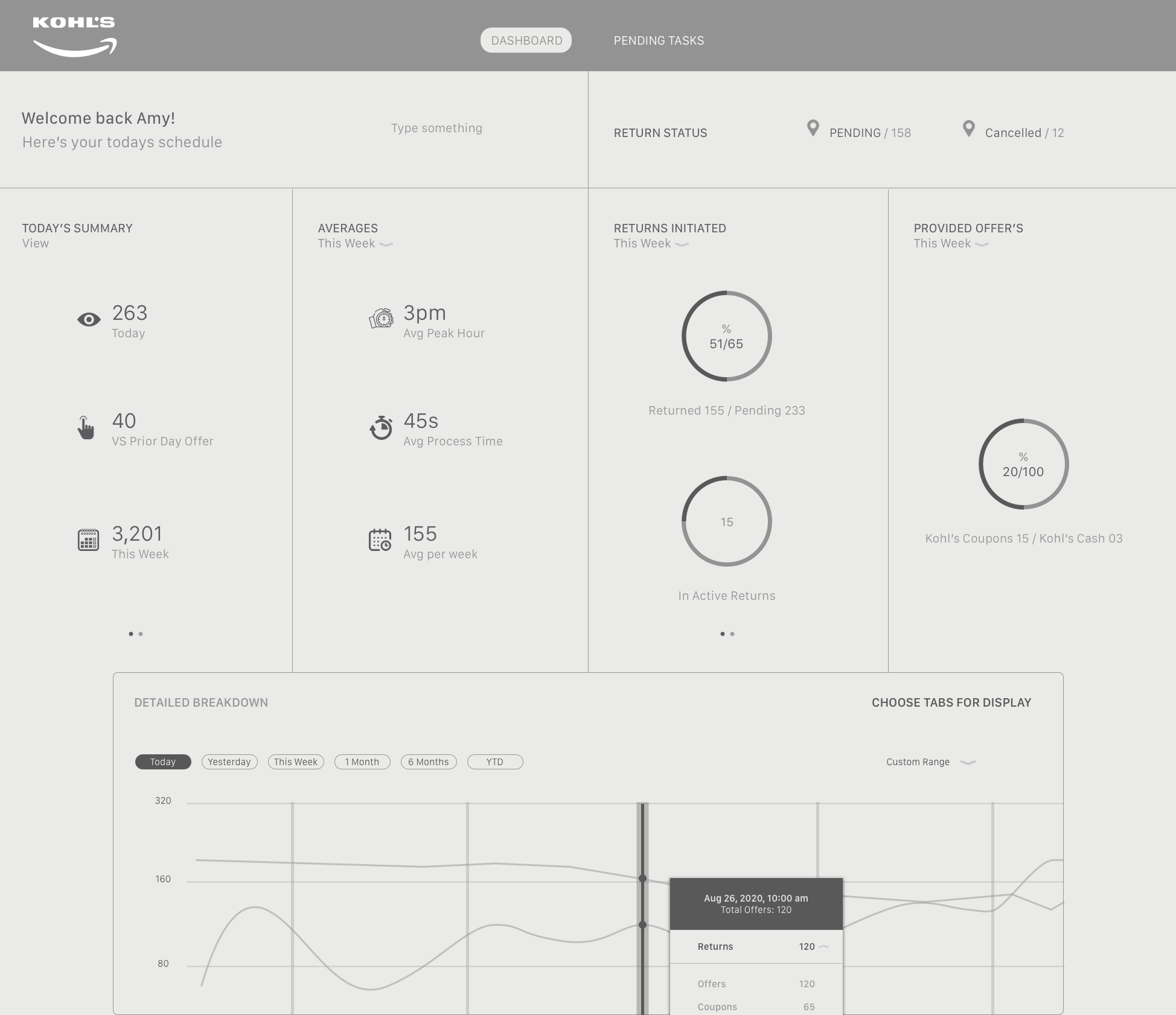
The dashboard is a customers high-level overview of all of the data the system has reported back. Each section of the interface is tailored toward a specific task, giving the user fast access to the data that’s most important to them at that particular moment.
Roughing out my initial approach
Speaking with the client in depth before I got started it was clear to me that the dashboard needed to be simple yet house a wealth of information such as high-level metrics, a detailed interactive chart, individualized data, and even more charts and graphs. My initial thoughts centered around a wireframe that was a singular experience where this information could be accessed via one page.
High-level metrics
Detailed chart
Individualized data
More charts
Similarity visualization
What I quickly realized
As I began to fill in details within each section of the dashboard (abstracted below for simplicity’s sake) it became more clear that the volume of information was much more dense than would comfortably support an experience that was accessed via a single page.
I considered adding “load more” buttons under each section to give the user the best of both worlds initially (access to greater details within a section, while minimizing content on screen,) but that wasn’t the optimal solution. The client agreed and I continued to refine the experience, breaking up the content into two additional pages. Below, the left is my original approach, and the right shows a multi-page execution.

Details and due diligence
The very first view of the dashboard a user sees are high-level metrics such as Today's Summary from any given day or week, averages, offer types, and much more. And, since these metrics are generally numerical it was necessary to ensure enough space was allocated to the fluctuation each could encounter.
I used a modular or grid-like structure to maximize use of the space, lending ample room for data even when it grew wide. I introduced lined-style pie charts which are easy to read but can also easily communicate large amounts of information.
This execution was designed such that it would respond well to devices and screens of all sizes, and to support multiple pages of metrics, accessible via pagination at the bottom of a given column.
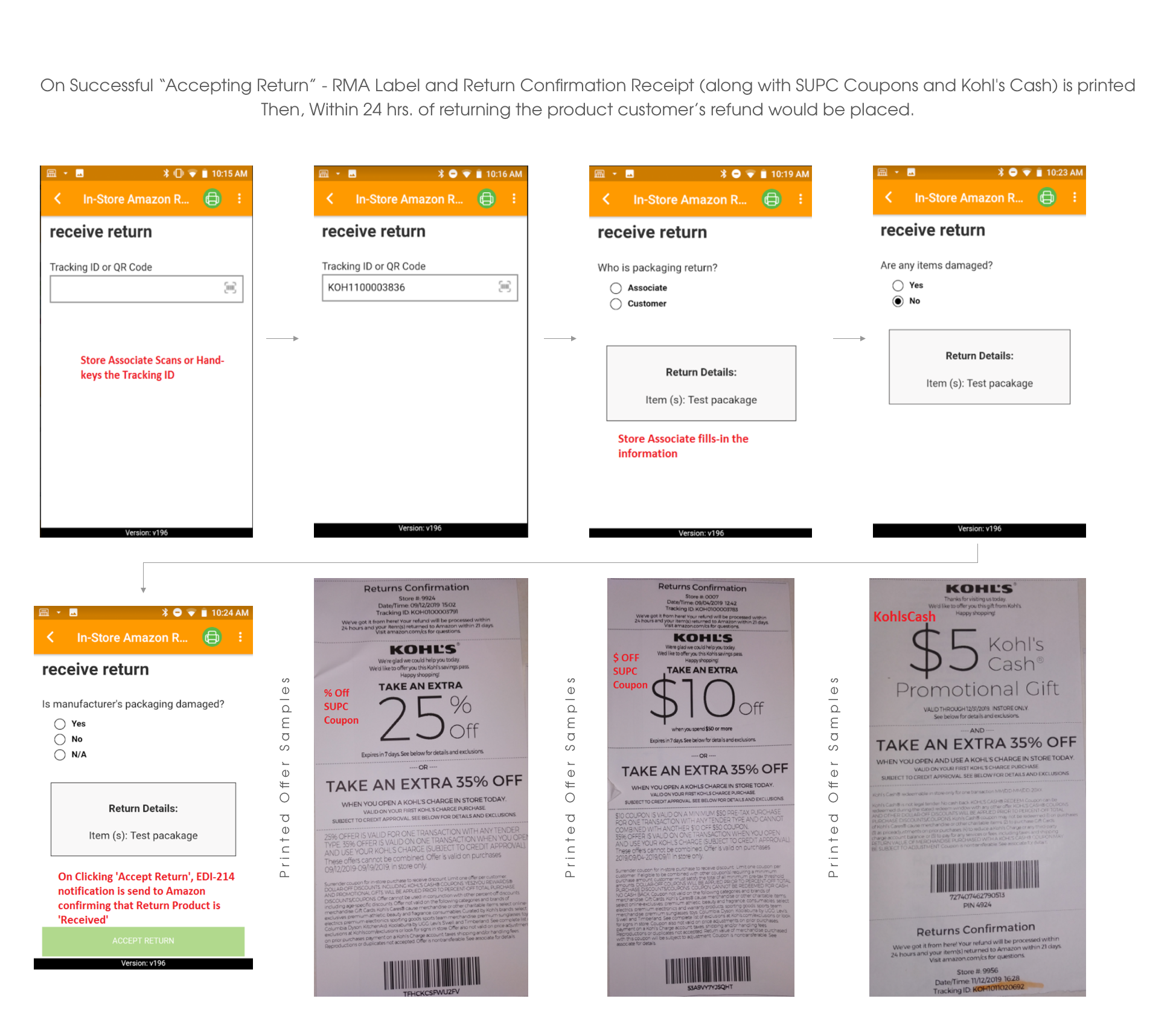
Enabling Associates to scan the code and accept the returns
One of the most important aspects of the interface is the ability to scan the QR or Bar code and the system reports back to the dashboard, and associates are allowed to print the offer coupons with receipt. There might be dozens of customers drive in a day, if not hundreds of sensor devices that report back data to the dashboard and print coupons. As such, the Detailed UI section provides maximum exposure and ability to select which options and data are relevant to the task at hand.
In this section the user can view the return details (from devices) by selecting a particular options. This affords the user precision at the most detailed level. The App itself is configurable by any number of timeframes—by week, month etc.
Upon hovering over a QR-code within the App, a fact-filled yet easy to understand tooltip displays relevant return details. Inside, each return can be allocated to the tote (Truck-ID) or expanded to view the return status that comprise it.
How App works at Stores
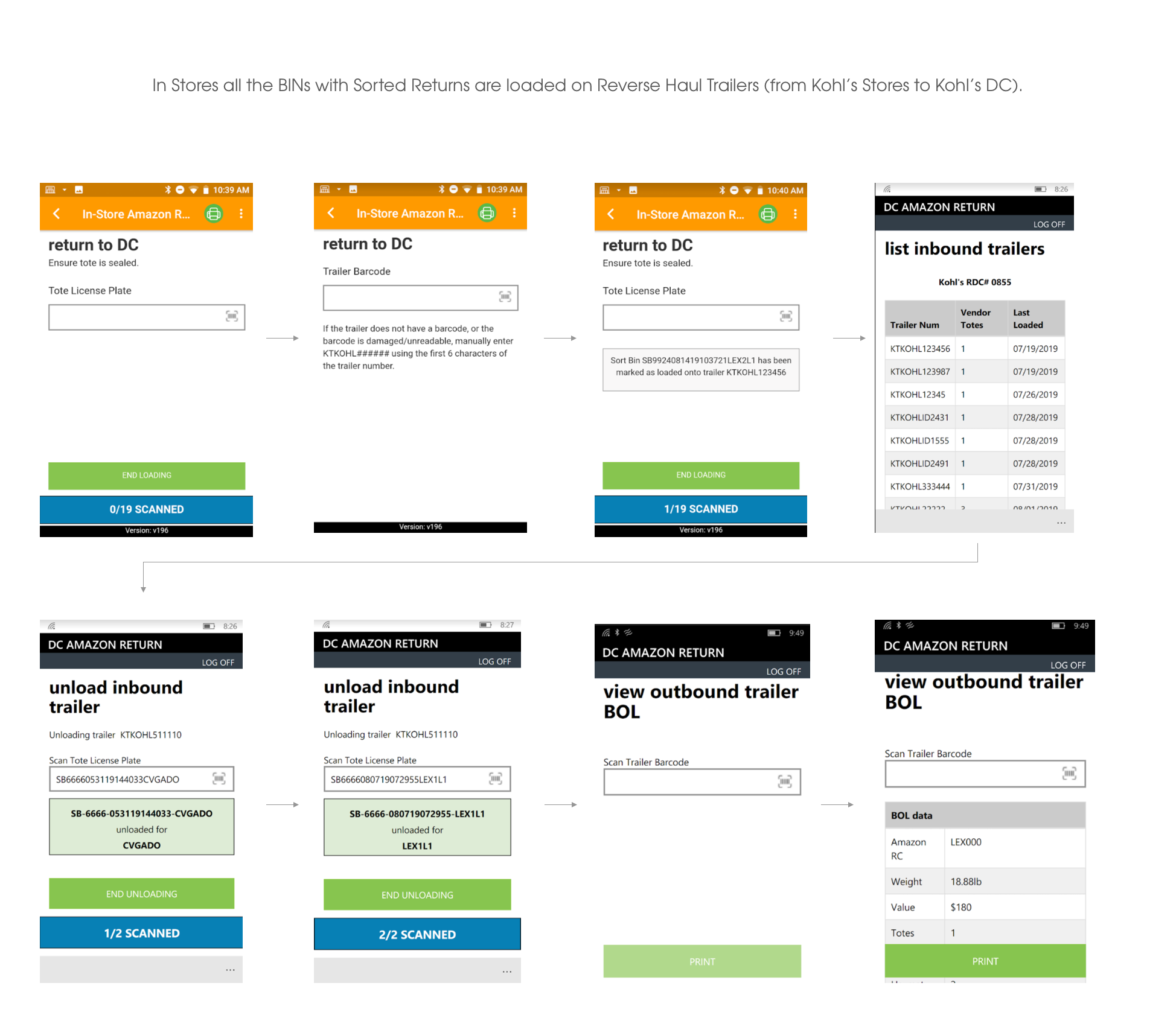
Functionality of Recieving the Amazon Returns
How App works at DC (Distribution center)
Hindsight
Amazon Returns App, It’s my hope to continue helping them solve complex product design challenges that revolve around big data and continually set the experiential/visual bar higher and higher.
Noteworthy insight
It was quite the undertaking to condense the data into palatable chunks, especially the portion at the top of the dashboard that provides a snapshot of high-level metrics. The client needed the ability to display vast and different types of data there while maintaining visual clarity. I achieved it by relying heavily on design principles… ample white space, and limited use of fonts to name a few. And on the technical side, content stacking helped create the versatility needed to display all of the data required.